The qualitative palettes are designed for categorical
data where each colour encodes a distinct group. circadia
provides two: main (8 colours) for complex figures, and
core (5 colours) as a compact everyday subset.
The main palette
Eight brand colours spanning the full chromatic range — use when you have up to 8 categorical groups.
Click any swatch to copy the hex code.
ggplot(mtcars, aes(wt, mpg, colour = factor(cyl))) +
  geom_point(size = 3, alpha = 0.85) +
  labs(
    title   = "Fuel efficiency by engine size",
    colour  = "Cylinders",
    x       = "Weight (1000 lbs)",
    y       = "Miles per gallon"
  ) +
  scale_colour_circadia() +
  theme_circadia()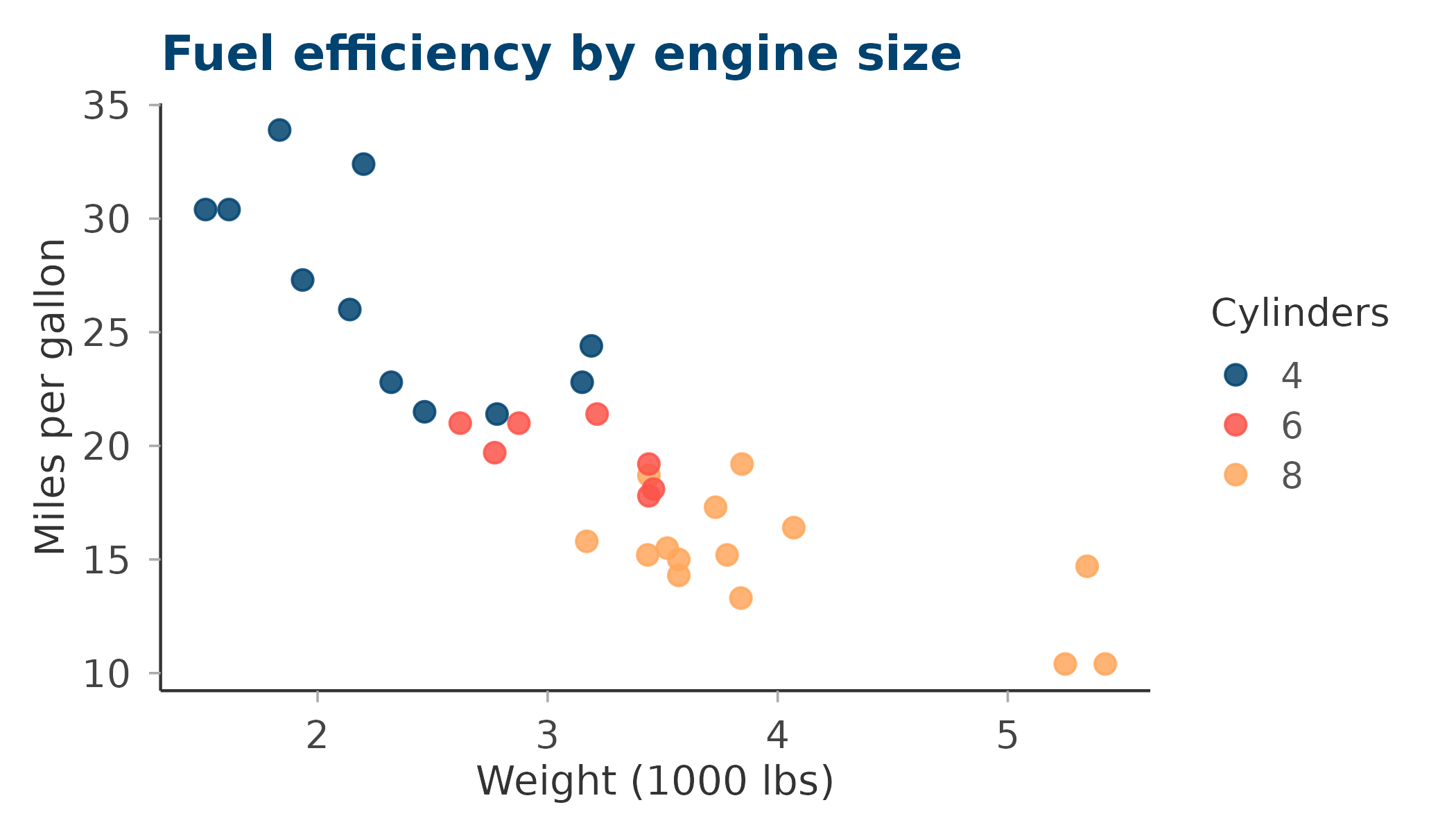
ggplot(mpg, aes(class, fill = drv)) +
  geom_bar(position = "dodge") +
  labs(
    title = "Vehicle classes by drive type",
    fill  = "Drive",
    x     = NULL, y = "Count"
  ) +
  scale_fill_circadia() +
  theme_circadia(grid = "y")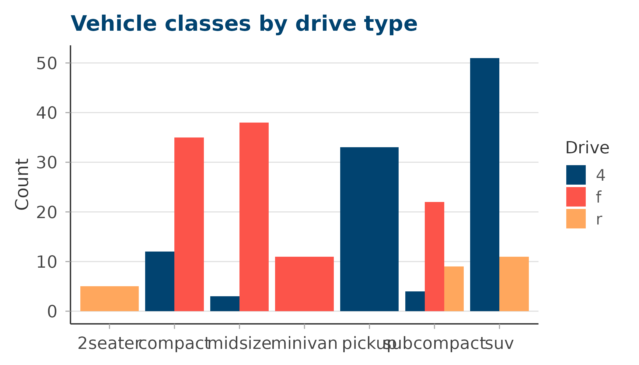
The core palette
A compact 5-colour subset — the four anchors plus ochre. Use this for figures with five or fewer groups where you want the cleanest possible colour separation.
ggplot(mpg, aes(displ, hwy, colour = drv)) +
  geom_point(size = 2.5, alpha = 0.8) +
  labs(
    title  = "Engine displacement vs highway mpg",
    colour = "Drive type",
    x      = "Displacement (L)", y = "Highway mpg"
  ) +
  scale_colour_circadia(palette = "core") +
  theme_circadia()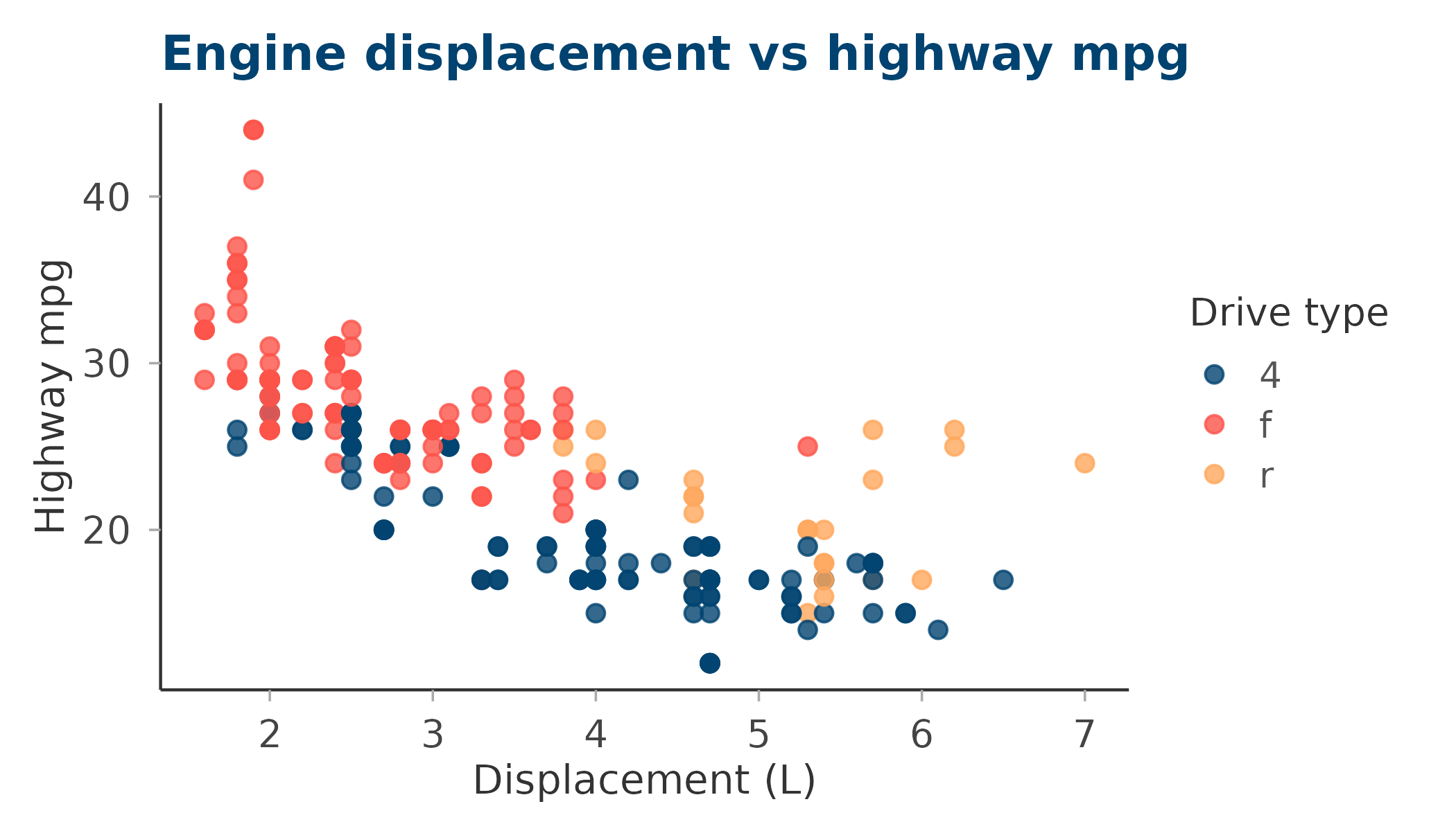
Reversing the palette
Pass reverse = TRUE to flip the colour order — useful
when you want the lightest colour to map to the first factor level.
ggplot(mtcars, aes(factor(cyl), mpg, fill = factor(cyl))) +
  geom_boxplot(alpha = 0.85, show.legend = FALSE) +
  labs(
    title = "MPG distribution by cylinders — reversed palette",
    x     = "Cylinders", y = "Miles per gallon"
  ) +
  scale_fill_circadia(palette = "core", reverse = TRUE) +
  theme_circadia(grid = "y")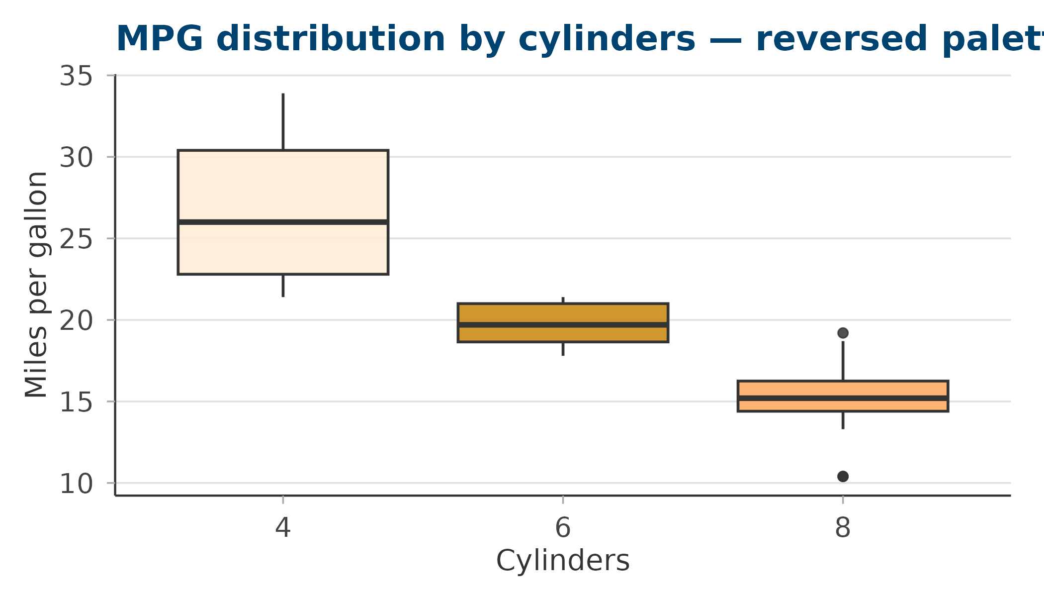
Retrieving colours directly
Use circadia_palette() when you need the raw hex values
— for example, to pass to ggplot2::scale_colour_manual() or
base R graphics.
# Full main palette
circadia_palette("main")
#>     deep_blue     coral_red         amber         ochre antique_white
#>     "#014370"     "#FC544A"     "#FFA75D"     "#C8860A"     "#FFECD4"
#>      mid_blue    steel_blue     pale_teal
#>     "#1B6799"     "#4A9BBF"     "#9BDFE2"

# First three colours from core
circadia_palette("core", n = 3)
#> deep_blue coral_red     amber
#> "#014370" "#FC544A" "#FFA75D"

# Reversed blues
circadia_palette("core", reverse = TRUE)
#> antique_white         ochre         amber     coral_red     deep_blue
#>     "#FFECD4"     "#C8860A"     "#FFA75D"     "#FC544A"     "#014370"